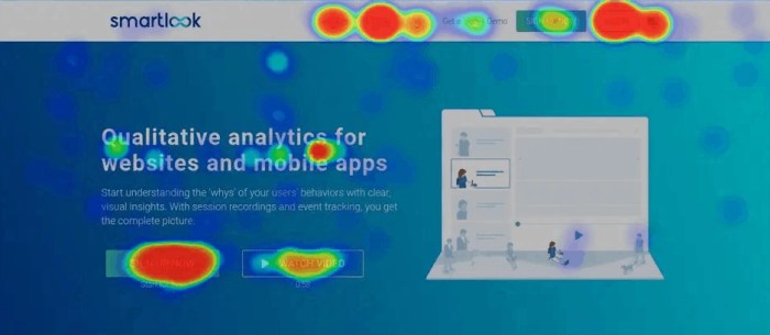
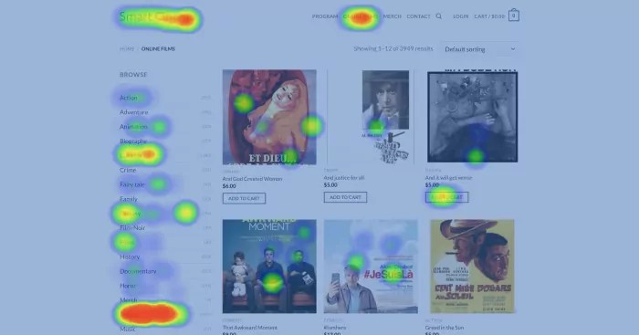
Understanding Website Heatmaps sets the stage for this enthralling narrative, offering readers a glimpse into a story that is rich in detail with american high school hip style and brimming with originality from the outset.
Website heatmaps are like the coolest tool in web analytics, showing you where people click, scroll, and move on your site. It’s like having X-ray vision for your website, seeing how users interact in ways you never thought possible. Get ready to dive into the world of website heatmaps and discover the hidden gems of user behavior!
Introduction to Website Heatmaps

Website heatmaps are visual tools used in web analytics to track user interactions on a website. They provide valuable insights into how users engage with a site, allowing website owners to optimize layout, content, and functionality for better user experience. There are several types of website heatmaps, including click maps, scroll maps, and move maps, each focusing on different aspects of user behavior.
Types of Website Heatmaps
- Click maps: These heatmaps show where users are clicking the most on a webpage, highlighting popular areas and elements.
- Scroll maps: Scroll maps indicate how far down a page users are scrolling before losing interest, helping to optimize content placement.
- Move maps: Move maps track mouse movements on a webpage, revealing areas of interest and user engagement.
Popular Tools for Generating Website Heatmaps
- Hotjar: Hotjar is a widely used tool that offers heatmaps, session recordings, and surveys to gather user feedback and behavior data.
- Crazy Egg: Crazy Egg provides heatmaps, scroll maps, and user recordings to analyze user behavior and improve website performance.
- Mouseflow: Mouseflow offers heatmaps, session replays, and form analytics to help website owners understand user behavior and optimize conversions.
Understanding Click Maps
Click maps are visual representations of user interaction on a website, showing where users click the most and least. These maps provide valuable insights into user behavior and help identify areas of interest or confusion on a webpage.
Key Insights from Analyzing Click Maps
- Popular Click Areas: By analyzing click maps, you can identify the most clicked areas on a webpage, indicating what content or features users find most engaging.
- Dead Zones: Click maps also reveal areas where users are not interacting, highlighting potential areas for improvement or optimization.
- User Flow: Understanding the sequence of clicks can help optimize the user flow and enhance the overall user experience.
Tips for Interpreting Click Maps Effectively, Understanding Website Heatmaps
- Color Coding: Pay attention to the color intensity in click maps, as it signifies the frequency of clicks in different areas.
- Hover Behavior: Analyze how users interact with clickable elements by observing hover behavior in click maps.
- Scroll Depth: Consider scroll depth in conjunction with click maps to gain a comprehensive understanding of user engagement.
Exploring Scroll Maps: Understanding Website Heatmaps
Scroll maps are tools that track user scrolling behavior on a webpage. They provide valuable insights into how far down the page users are scrolling, indicating which sections are most engaging and which are being overlooked.
Significance of Scroll Maps
Scroll maps are crucial for understanding content engagement on a webpage. By analyzing scroll data, businesses can identify areas where users are losing interest or not reaching, allowing them to optimize their content for better engagement.
- Scroll Depth: Scroll maps show how many users are scrolling to different sections of the page. By analyzing this data, businesses can adjust content placement to ensure important information is seen.
- Content Optimization: Based on scroll map data, businesses can optimize their content layout by moving key information higher on the page to increase visibility and engagement.
- User Experience: Scroll maps help improve user experience by highlighting where users are dropping off or losing interest. This allows businesses to make necessary adjustments to keep users engaged throughout the page.
Analyzing Move Maps

Move maps are a type of heatmap that represent the movement of the mouse cursor on a website. They capture mouse movement patterns, showing areas where users are focusing, hovering, or getting stuck. By analyzing move maps, designers can gain valuable insights into user behavior and interactions on a web page.
Benefits of Using Move Maps
- Identifying popular areas: Move maps can help designers identify which areas of a website are receiving the most attention from users. This information can be used to optimize the placement of important elements such as calls to action or navigation menus.
- Improving user experience: By understanding how users navigate a website through their mouse movements, designers can make informed decisions to enhance the overall user experience. This can lead to increased engagement and conversions.
- Enhancing design elements: Move maps provide valuable data on how users interact with design elements such as images, buttons, and links. Designers can leverage this information to improve the visual hierarchy and layout of a webpage.
Best Practices for Utilizing Move Maps
- Combine with click maps: To get a comprehensive view of user behavior, it’s recommended to analyze move maps in conjunction with click maps. This combination can provide deeper insights into user interactions on a website.
- Optimize layout based on heat intensity: Areas with high mouse movement intensity on move maps indicate user interest. Designers should prioritize these areas for key content or features to maximize user engagement.
- Test different layouts: Use move maps to A/B test different website layouts to see which design performs better in terms of user engagement and interaction. This data-driven approach can lead to continuous improvement and optimization of the website.


