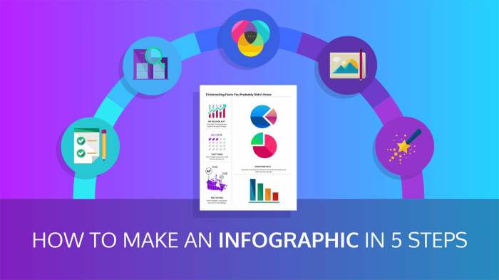
Designing Infographics is all about crafting engaging visual stories that bring data to life. From color schemes to data visualization techniques, this topic delves into the art of creating captivating infographics that resonate with audiences.
Understanding Infographics
Infographics are visual representations of information or data designed to make complex concepts easier to understand and digest for viewers. They combine text, images, and graphics to present information in a more engaging and memorable way.
Purpose of Infographics
Infographics serve the purpose of simplifying complex information, making it more accessible and engaging for the audience. They help in conveying data and statistics in a visually appealing format, enhancing comprehension and retention.
Benefits of Using Infographics
- Enhanced Visual Appeal: Infographics are visually attractive and grab the viewer’s attention more effectively than plain text.
- Improved Retention: Visual aids like infographics help in better retention of information compared to text-only content.
- Increased Engagement: Infographics have the potential to engage the audience and encourage social sharing, leading to wider reach and impact.
Comparison with Other Visual Aids
Infographics are different from traditional visual aids like charts and graphs in that they provide a more comprehensive overview of information. While charts and graphs are useful for presenting numerical data, infographics combine text and visuals to tell a complete story, making them more versatile and engaging for the audience.
Design Principles for Infographics

When it comes to creating killer infographics, there are some key design principles you gotta keep in mind to make sure your visuals pop and grab attention like a boss.
Color Schemes and Typography
Color schemes and typography play a major role in making your infographic stand out. Choose a color palette that complements your brand and helps guide the reader’s eye through the information. Use contrasting colors to create a visual hierarchy and make important points pop. When it comes to typography, make sure your fonts are easy to read and align with the overall tone of your infographic.
Examples of Well-Designed Infographics
Check out these dope infographics that are slaying the game right now:
– The New York Times COVID-19 Tracker: This infographic uses a clean layout, bold colors, and clear typography to present complex data in a digestible way.
– National Geographic Climate Change Infographic: With stunning visuals and a cohesive color scheme, this infographic effectively communicates the urgency of climate change.
– Airbnb Neighborhood Guides: These infographics use a mix of photos, icons, and text to provide valuable information in a visually appealing way.
Remember, when it comes to designing infographics, it’s all about finding the perfect balance between style and substance. Keep these design principles in mind, and you’ll be creating eye-catching infographics that make a statement in no time.
Data Visualization Techniques: Designing Infographics

Data visualization techniques are essential in creating effective infographics that communicate information clearly and engagingly. By choosing the right type of visualization for different types of data, you can enhance the understanding and impact of your message. It is crucial to prioritize clarity and accuracy when representing data visually to ensure that your audience interprets the information correctly.
Bar Graphs
Bar graphs are commonly used to compare quantities or show trends over time. Each bar represents a category, and the length of the bar corresponds to the value being measured. They are great for displaying discrete data and making straightforward comparisons. Remember to label your axes clearly and choose appropriate scales for accurate representation.
Pie Charts
Pie charts are useful for showing parts of a whole and comparing proportions. Each slice of the pie represents a percentage of the total, making it easy to visualize how different components contribute to the whole. Be cautious with using too many slices in a pie chart, as it can become cluttered and difficult to interpret. Use pie charts when you want to highlight the relative importance of each category.
Line Graphs, Designing Infographics
Line graphs are effective for displaying trends and changes over time. They connect data points with lines, allowing viewers to see how values evolve continuously. Line graphs are ideal for showing patterns, correlations, and fluctuations in data. Ensure your lines are smooth and clearly labeled to convey the intended message accurately.
Infographics Tools
Utilizing various infographic tools can also enhance the visualization of data. Platforms like Canva, Piktochart, and Adobe Illustrator offer templates, graphics, and customization options to create visually appealing infographics. Experiment with different tools to find the ones that best suit your data visualization needs.
Tools and Software for Creating Infographics
Creating stunning infographics requires the right tools and software. Let’s explore popular options and tips for beginners to choose the best software for their infographic design needs.
Popular Infographic Design Tools
- Canva: A user-friendly platform with drag-and-drop functionality, offering a wide range of templates and design elements.
- Adobe Illustrator: Ideal for creating custom and intricate infographics, with robust design features and flexibility.
- Piktochart: An easy-to-use tool with customizable templates and a library of icons, images, and charts.
Comparing Infographic Design Tools
- Canva is great for beginners and non-designers due to its simplicity, while Adobe Illustrator offers advanced design capabilities for professionals.
- Piktochart strikes a balance between ease of use and design flexibility, making it suitable for a wide range of users.
Tips for Choosing the Right Software
- Consider your design skills and experience level to determine if you need a beginner-friendly tool or a more advanced software.
- Assess the features and templates offered by each tool to ensure they align with your infographic design goals and requirements.
- Read reviews and tutorials to learn more about the user experience and functionality of different infographic design tools before making a decision.